Photoblog 4
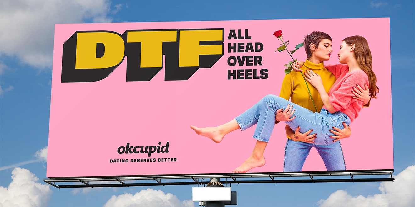
At the start of the year the dating company OkCupid released a campaign with the title "DTF", which is acronym that means "Down to F*ck". The concept was straight to the point and reflected how users felt when using an online dating app. The use of striking colors create contrast, space, balance, and unity are key technical aspects that are seen in graphic design.
Contrast:
In this advertisement the use of contrast is a key element that creates a youthful design that is busy, with bright colors. The colors used in the advertisement creates a contrast with the use of pink and yellow seen throughout the advertisement that create unity. The use of yellow in the bolded text creates tension, because the acronym stands out and is in color verses the smaller text seen right beside the bolded acronym. The size of the couple is also seen as larger, but pushed off to the side. In doing so, the viewer is looking at the ad they are supposedly reading the text first and then would look at the couple ideally.Space:
The use of space is seen throughout the entire advertisement because there is a lot of blank space, but because of this there is a modern and classy feel given to the advertisement. This is beneficial to the dating company because they are trying to give online dating a more modern feel featuring a same sex couple but also keeping it classy with the rose and bridal style pose of the couple.Balance:
As you can see the couple is positioned off to the right side, while the text is bold and on the left beside the couple. There is some balance seen in the advertisement, but for the most part the advertisement is completely asymmetrical. Having an asymmetrical appearance gives the advertisement
a less formal appeal, and this is important because the dating company is attempting to give online dating a casual appearance and make the advertisement interesting rather than have a conservative appearance scaring potential OkCupid users with the idea of online dating.Unity:
Throughout the advertisement the use of simple color palette has some contrast with the use of pink and yellow, but those are mainly the only colors used and in doing so there is unity that is created. The unity does the advertisement well, because there is stylistic consistency and it feels as if you are looking at the same advertisement when you look at the entire piece. There is nothing drastically different seen in the advertisement that creates a clash or too much tension. Unity seen in the advertisement makes it easy to read and understand and gets the dating company's message across about online dating.


Comments
Post a Comment